
")
Let’s face it – regardless of all perceived functional benefits, aesthetics also play a critical role in user engagement and retention. When users interact with a product, their first impression is shaped by visual elements such as color, typography, and layout. These elements not only determine how attractive a product looks, but also influence how users feel about it.
Desirability in the UX design of a physical or digital product ensures that users form a positive emotional connection with a product, increasing the likelihood of continued use. But how exactly do these elements shape product desirability? How can UX designers measure and refine them using desirability studies?
Read on to find out more about the impact of color, typography, and layout on UX and how these elements shape a product’s appeal!
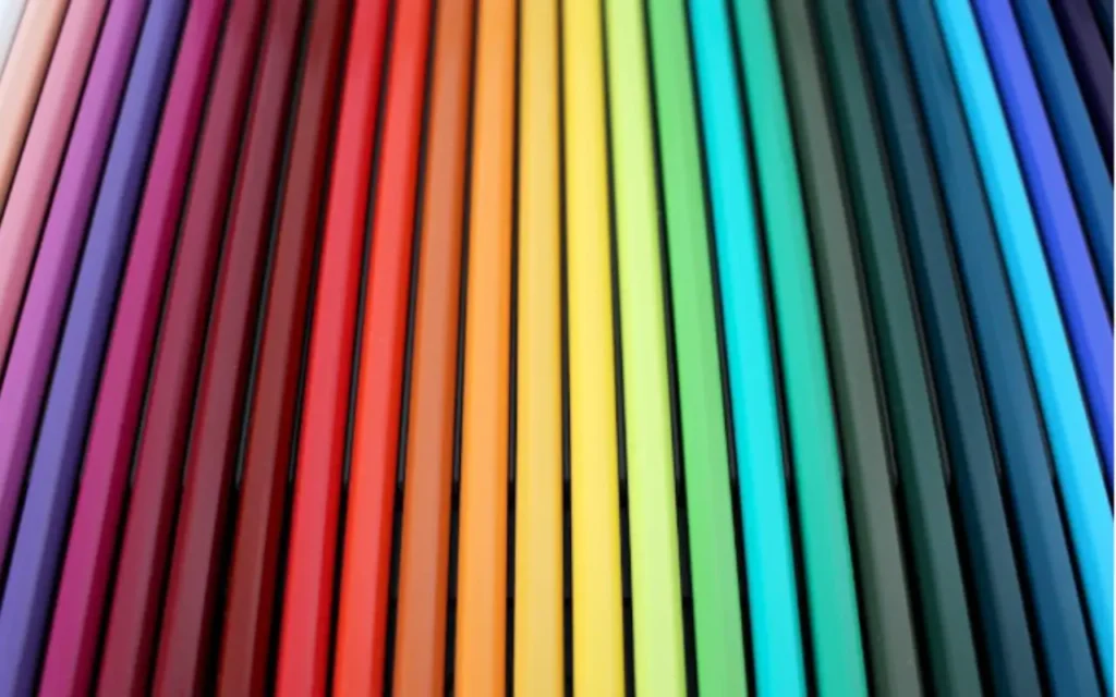
The impact of color on product desirability and UX design
Color is one of the most powerful psychological tools in UX design. It affects mood, perception, and even decision-making. People usually form an opinion about a product within a couple of minutes after first seeing it, and most of that judgment is based on color.
Different colors can evoke different emotions and associations. Choosing the right colors can enhance a product’s appeal, while poor color choices can drive users away right after the first impression.
Here are some common examples used in different industries:
- Blue – Trust, reliability, and professionalism (mostly used in banking, corporate, and tech industries).
- Red – Excitement, urgency, passion (common in e-commerce, entertainment, and sports).
- Green – Health, nature, and sustainability (ideal for eco-friendly brands and wellness products).
- Yellow – Optimism, energy, warmth (great for playful or youth-focused brands).
- Black – Luxury, elegance, sophistication (often used in high-end product design).
- White – Simplicity, cleanliness, minimalism (preferred for modern, sleek interfaces).
Beyond the role of color in branding, companies should also be aware that contrast plays a crucial role in usability. If text and background colors do not have enough contrast, readability suffers, leading to poor UX.
A high-contrast interface ensures that users can read content effortlessly, enhancing both usability and desirability.
How desirability studies refine UX design
To create products that users love, designers must understand how design elements influence emotions. This is where desirability studies come in.
These studies can cover a multitude of aspects to dig deep into what your users want and measure users’ emotional responses to different design variations. Desirability studies at UX agencies such as Ergomania typically involve:
- Showing users multiple design prototypes.
- Asking them to describe their feelings using predefined adjectives.
- Analyzing which elements evoke the most positive reactions.
Typography’s role in enhancing the user experience and desirability of a product
Typography goes beyond aesthetics—it directly impacts legibility, accessibility, and user engagement. Choosing the right typeface can make a product feel modern, reliable, or playful, shaping user perceptions.
Typography also influences how users experience and interact with digital products. Even with the perfect font, poor spacing can reduce readability.
UX designers can help their clients focus on:
- Line height – Too little space makes text feel cramped; too much makes reading difficult.
- Letter spacing – Tight kerning can make letters blend together, affecting clarity.
- Font weight – Bold text emphasizes key points, but overuse reduces impact.
Typography directly impacts how engaged and comfortable users feel when interacting with a product. A well-structured UX design always takes these factors into account, ensuring a seamless reading experience.

Layout and visual hierarchy in desirability UX design
A well-structured layout helps users navigate a product effortlessly. If an interface is cluttered or confusing, users may abandon it in frustration.
Effective UX layouts rely on the following key principles:
- Visual Hierarchy – Organizing elements so that the most important information stands out.
- Whitespace – Giving users breathing room to focus on key content.
- Consistency – Keeping design elements uniform across the interface for easy recognition.
- Alignment – Ensuring text and elements are aligned properly for a clean and structured look.
A strong layout strategy improves usability and makes a product more desirable by creating a fluid and intuitive user experience.
Further Reading


